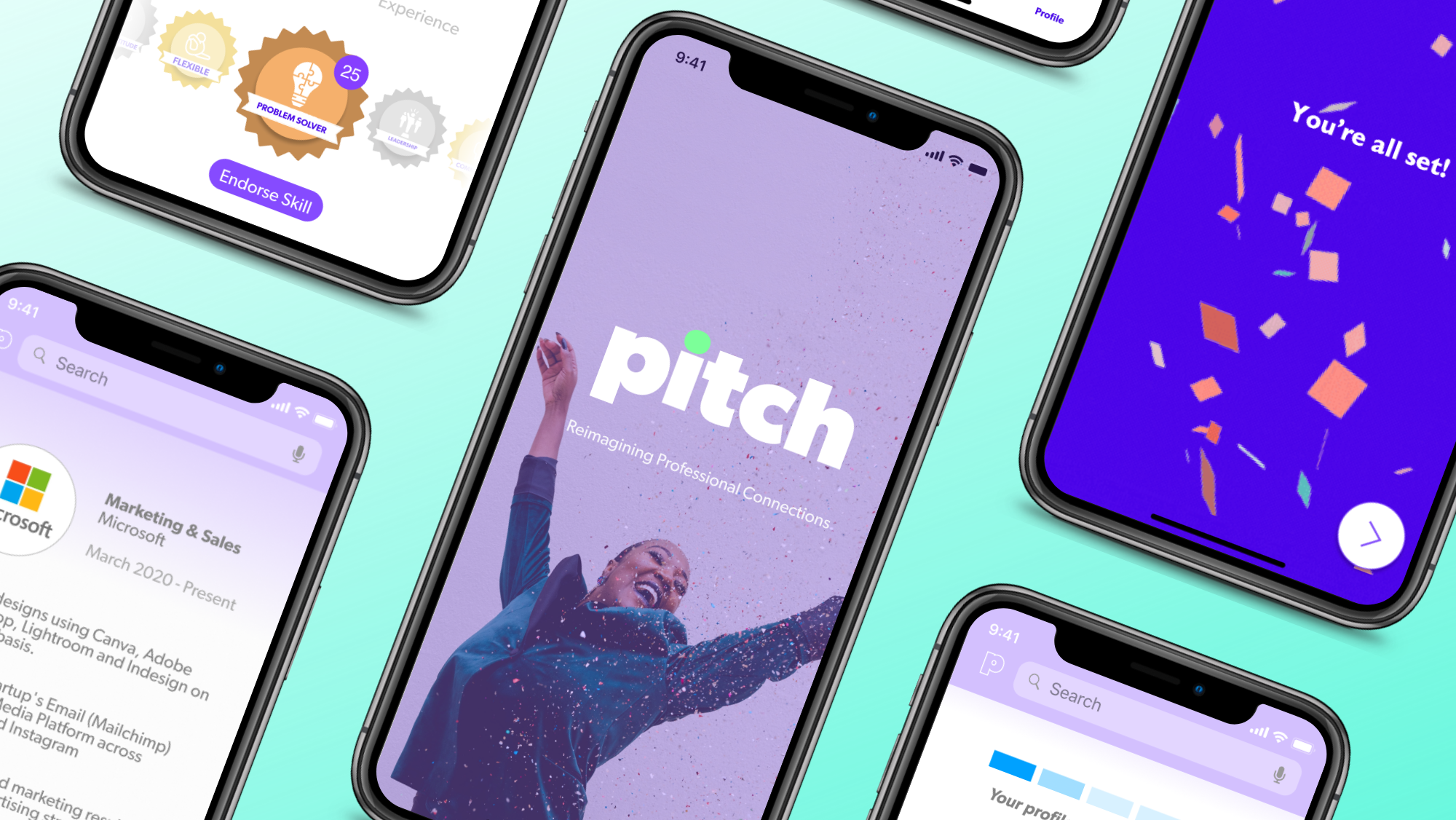
With users hungry for an alternative to LinkedIn’s rigidity, Pitch provides individuals with a platform to present their true selves.

My Role: UX Researcher & Designer // Tools: Figma, Zeplin, Keynote // Duration: 3 Weeks
OVERVIEW
Pitch reimagines professional networking by allowing people to build authentic relationships through shared values, interests, and goals.
I partnered with three UX professionals, and together we set out to build a clickable prototype. Informed by our research, we built a unique on-boarding flow, profile-creation, and profile-viewing experience, ready to provide a more comprehensive understanding of companies, employees, and job-seekers alike.
CHALLENGE
As recruitment and connection move increasingly online, establishing new professional relationships becomes more difficult. Many users strive to position themselves as the “perfect candidate”, but struggle to find a place where they can bring their full self to work. Getting to know each individual is often overlooked in service of getting to know their qualifications.
In the US alone, mis-hires account for the loss of over a trillion dollars yearly.
RESEARCH
We began our process by first identifying some initial assumptions:
Employer / employee relationships lack transparency and a humanized approach.
Traditional interviews may touch on concrete facts about a company, but don’t reveal the management styles present within that company.
Current professional platforms cannot assess if a candidate is a good cultural fit.
Individuals want to highlight their soft skills and interests in order to form deeper connections.
In order to determine if users were indeed limited by what they could share on professional networking sites, we conducted interviews with members of our target audience, and utilized Affinity Mapping to identify trends within the data collected. This synthesis method helped us draw out key takeaways and formulate a more concrete sense of our target user’s goals, needs, and pain points.
We validated that users feel their resumes don’t accurately reflect their personality.
Users rely on their bio to showcase their character, but wish they had a more effective way to highlight their soft skills.
Users establish new connections based upon shared interests and other similarities.
Most feel that their last job was misrepresented by its platform description.
Many users utilize LinkedIn purely as a job-seeking tool.
“I think sometimes it gets lost-in-translation that you’re a real human, and not just a working robot.”
With these insights, our team crafted a visual personification of our target audience — a fictional young sales representative named Jasmine. Through imagining Jasmine interacting with our product, we were able to better empathize with our users’ goals and needs, as well as the pain-points that we sought to alleviate.
“I'm transitioning from the tech space into real estate. I want to network with like-minded people, but I'm not sure where to start.”
We visualized Jasmine’s process as she moved away from the sales industry and into her new career as a real estate agent. Through Journey Mapping, we were able to paint a clear picture of Jasmine’s emotional highs and lows, and we found pain-points to leverage in order to create a better experience.
With our findings in mind, we asked ourselves:
How might we provide users such as Jasmine with a networking tool that helps cultivate authentic connections, while allowing them to present both personal and professional stories?
Armed with our user research, our team entered into an exploration of the networking industry. As we identified brands, product specializations, & target audiences, we built upon our own opportunity space. Through building a Competitive Matrix, we identified some key takeaways:
Competitors largely fall within the job-seeking and networking space, which include limited reviews and little insight into the day to day activities within a firm.
There is a lack of focus on meaningful networking.
Social media competitors allow users to share more about their personality/ hobbies/ interests.
To further understand the landscape and avoid redundancies, we then drew up a Competitive Analysis chart. Though networking platforms employ largely similar features, areas of high focus are clear:
Demonstrate user knowledge
Showcase user credibility and capabilities
Provide skill endorsements and personalized resumes
Allow users to comment and interact with each other
DESIGN
Our research reinforced our assumptions, and we validated that showcasing users’ personalities and their work experience are indeed important for establishing Pitch’s significance. We learned that competitors are largely situated within the job-seeking realm, and include limited insight into individuals’ daily lives, both in and outside of the workplace. The display of hard skills is prioritized over meaningful networking, and little may be understood about a person beyond their resume.
As we began our design process, we conducted a design-studio in order to determine, as a team, how the overall layout and structure of the Pitch application should appear. We ideated various features throughout multiple sessions, and eventually collaborated in sketching a loose version of our prototype on paper.
Our client had already predetermined many of the app’s key specs, such as color scheme and typography. Moving forward into the digital phase of our ideation, we focused on implementing the bold color palette in a digestible way.
INTRODUCING
KEY FEATURES
Onboarding
We narrowed a list of sixty potential on-boarding questions down to the five that would eventually be posed, and structured our design to include a single question per screen.
With an app geared towards inviting familiarity, we made sure to choose a diverse and inclusive range of images to occupy our splash screens and page accents.
Profile Creation
Users may upload a profile picture and choose to display relevant soft-skill badges— creating their own or picking from a predetermined library.
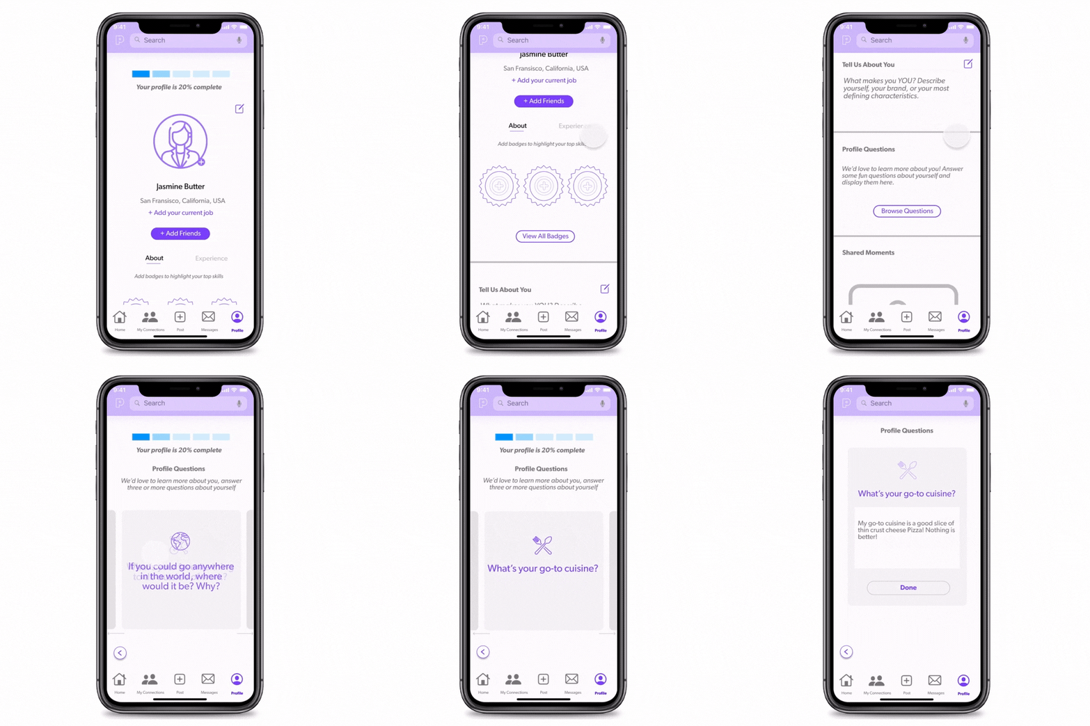
They may also browse unique questions by swiping through a carousel of prompts, and return to their profile by tapping on left arrow button. A segmented indicator at the top of the screen indicates their profile’s percentage of completion.
Profile Viewing
Users can swipe through and endorse Jasmine's soft skill badges, noting the number of people who have also endorsed each badge. They may explore the questions Jasmine has chosen to feature on her profile, including her hobbies and interests.
Navigating to the the “Experience” tab, users may view Jasmine’s hard skills, as well as her jobs and colleagues. Users may expand job descriptions to learn more about Jasmine’s company and role, and browse related pictures she’s shared.
USABILITY TESTING
To evaluate our minimum viable product (MVP), we invited members of our target user-base to participate in testing. We observed subjects as they attempted to complete tasks related to on-boarding, profile-creation, and profile-viewing. Check out a a few examples to see what we learned!
Task: See who’s on Jasmine’s team at Microsoft
Observation: 3/5 users assumed that the “Timeline” label referred to social-media-style posts. Participants disregarded the tab and looked elsewhere.
Solution: We changed “Timeline” to “Experience” in order to clarify that this tab was dedicated to Jasmine’s work history.
Task: Add your favorite food to your profile
Observation: 3/5 users failed to complete this task, unaware that swiping left or right would reveal additional questions, including one regarding preferred food.
Solution: We added and darkened adjacent cards to suggest a carousel formatting. We also introduced left and right arrows below the cards to indicate a swipe-navigation.
Based upon additional insights from data collected, we also increased the size of Jasmine’s profile badges and improved our prototype’s drag function. We resolved confusing aspects within on-boarding, limited redundant verification steps, and further humanized by app by replacing animated graphics with photographs of people.
This led to some exciting deltas in the second round of usability testing:
WHAT’S NEXT?
Our users understood and appreciated Pitch’s purpose in bridging the gap between their personal and professional lives. Users felt secure after on-boarding verifications, and enjoyed customizing their own profile by browsing questions, showcasing their soft skills, and choosing to highlight various aspects of their life.
Moving forward, our team recommends :
Holding a design studio to conceptualize the app’s home page and focus on additional profile-creation elements.
Introducing additional question prompts to continue encouraging users to reflect upon their experiences and share personal attributes.
Establishing an option for users to upload a short video “pitch” of themselves.
Regular testing to ensure Pitch’s intuitiveness and maintain a user-centered development.
Thanks for joining us on this journey!


