Persist
Creating lasting engagement in social activism
Role: UX Researcher & Designer | Duration: 3 Weeks |Tools: Figma, Zeplin, Keynote
Persist provides users access to fact-checked data and actionable resources within the activist sector. Within the past few years, issues that young generations now face have been thrown into sharp focus, with digital mis-information circulating at an all time high. Persist proposes partnerships across reputable sites in order to provide a platform comprised entirely of reviewed, trustworthy information.
Understanding
Familiarizing ourselves with the habits of our target demographic was crucial in formulating our problem space. As my team and I explored the affects of the recent turbulence upon the behaviors and emotions of Gen Zs and Millennials fighting for change, we discovered that many apprehend news via social media before navigating elsewhere to fact-check, citing a fundamental distrust of the information they receive.
Our primary research was conducted by interviewing five individual users between the ages of nineteen and thirty-five. We then moved on to a detailed market and business analysis before entering our design phase, where we assessed both a mid-fidelity and a high-fidelity prototype in the hands of our target audience.
Research
In order to recruit the appropriate subjects, we sent a screener survey to 19 potential participants, and selected the 5 who most closely fit our target audience. We then established a discussion guide, which allowed us to move through our interviews while asking participants targeted questions in a uniform manner. Each of the 10 questions we posed were open-ended, and prompted users to reflect on their behaviors. The same questions were asked of all participants in order for us to collect comprehensive, comparative data.
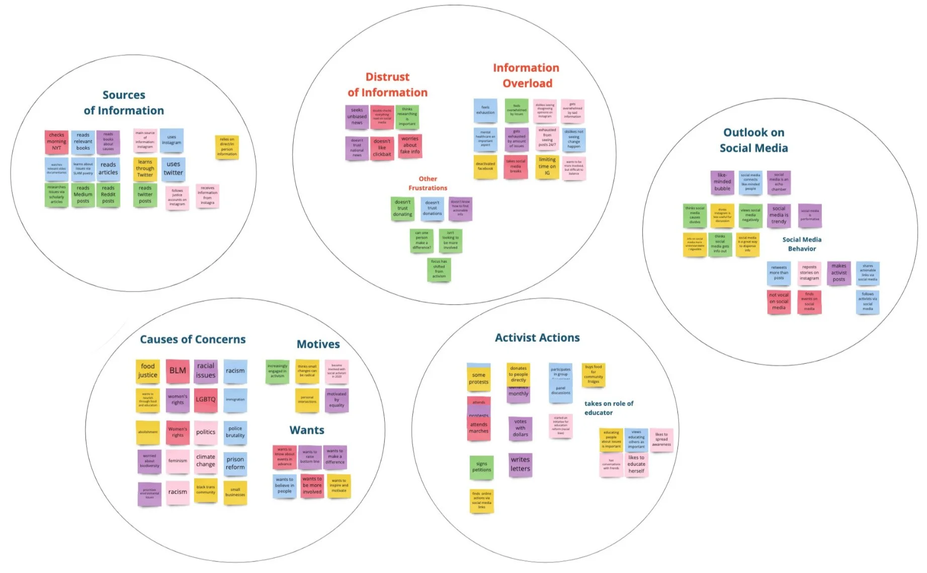
Affinity Mapping
After finalizing our interviews, we compiled and solidified the collected information within an Affinity Map. This research synthesis helped us to draw out key takeaways from our qualitative data, and formulate a concrete sense of our target user’s goals, needs, and pain points.
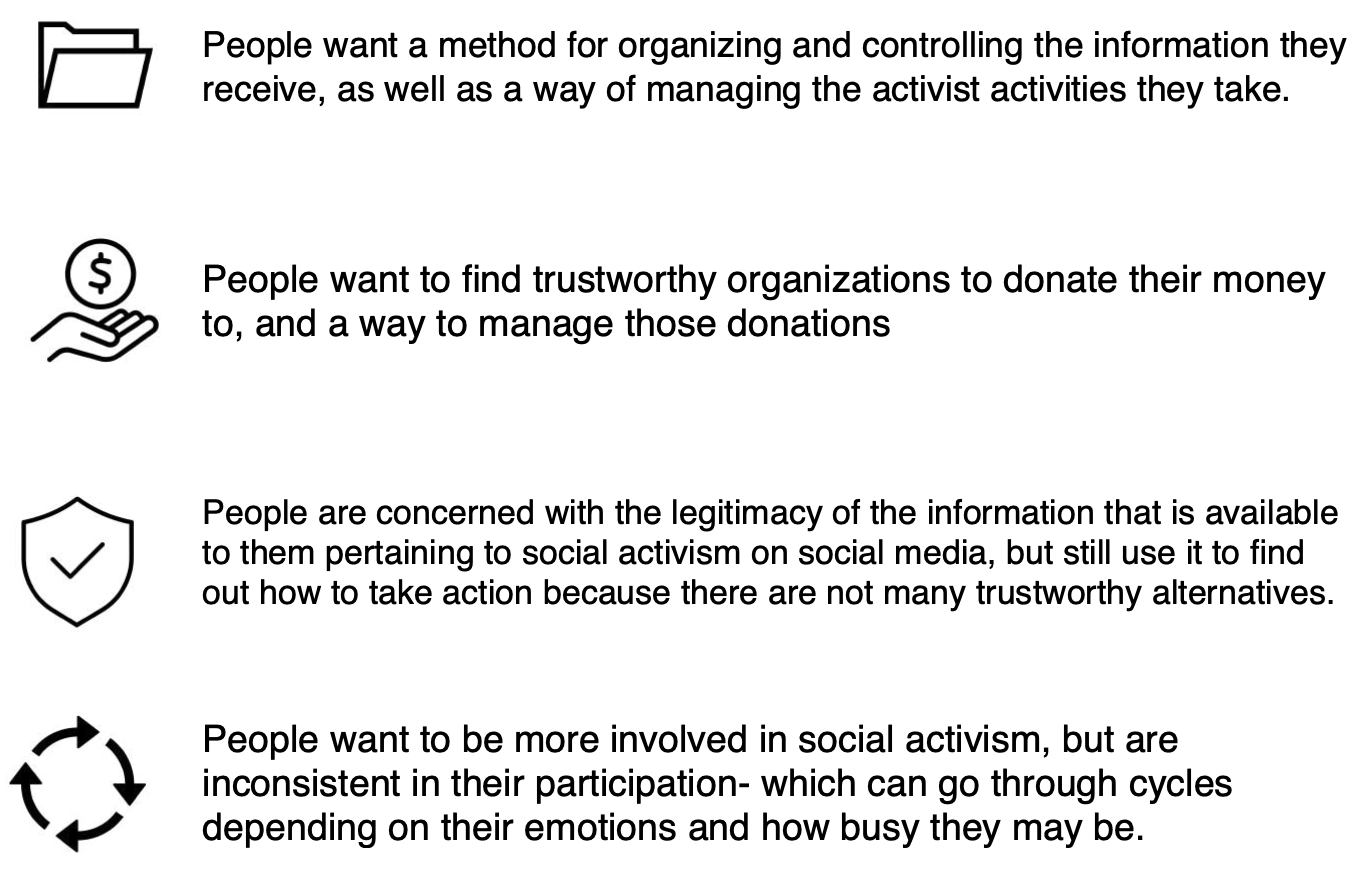
We validated that users are concerned with the legitimacy of the resources available on social media, but with few trustworthy alternatives, they still use these platforms to find actionable opportunities.
Users become increasingly overwhelmed by the high volume of information they receive through social media, yet the only means they have of controlling their intake is through abstaining entirely.
Many learn about fundraisers, protests, and other actions online, but find only limited ways to save and keep track of this information.
“Sometimes I won’t even find when that rally is…until literally the day of. It’s hard to know…unless I’m following an account that is very connected.”
Personifying our User
With insights gathered through our interviews, our team crafted a Persona, or a fictional representative of our target audience. By imagining this user interacting with our product, we could better empathize with our audience’s goals and needs, as well as the pain-points that we sought to alleviate.
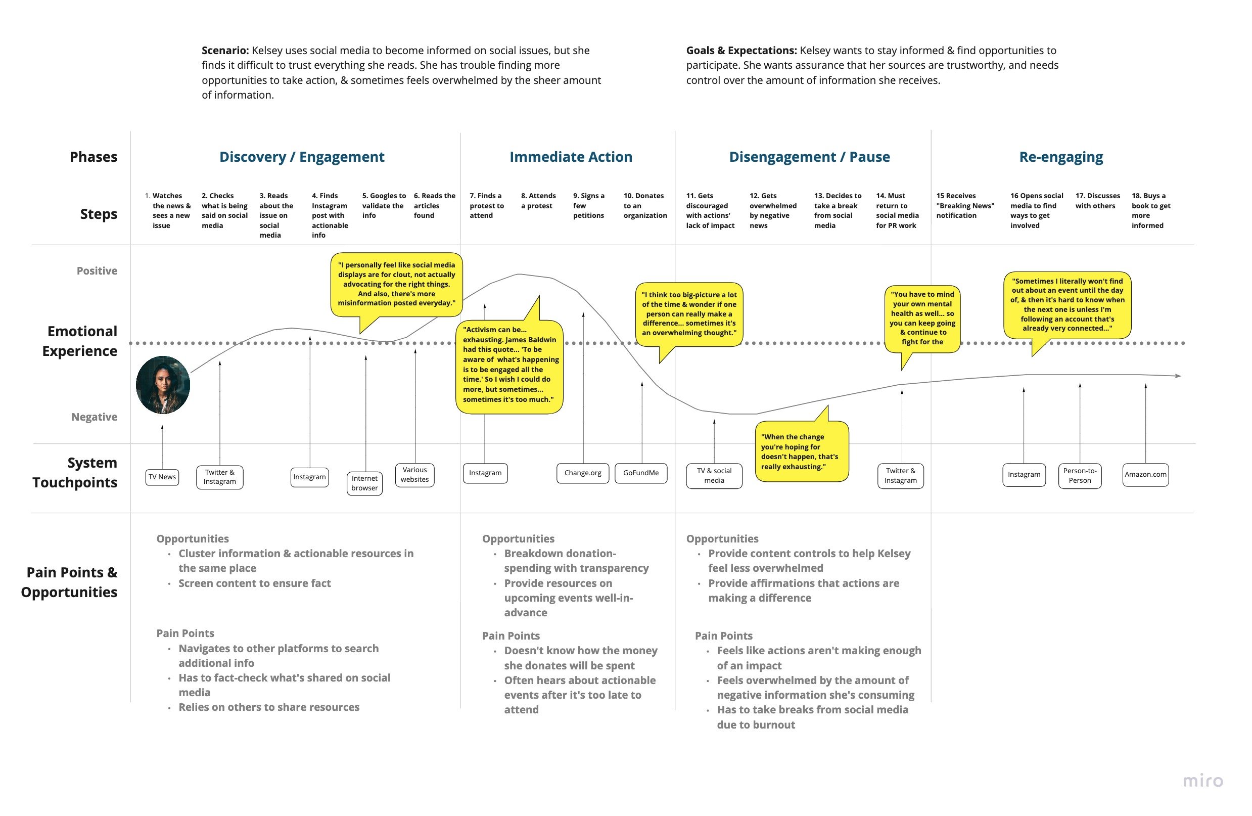
Kelsey, a twenty-five year old PR coordinator in New York City, finds it difficult to maintain involvement in the causes she cares about. Her busy schedule keeps her from dedicating much time to demonstrations, and constantly fact-checking what she sees on social-media leaves her feeling overwhelmed.
We visualized Kelsey’s process as she looked for ways to stay informed and engage in social justice. Synthesizing our data through a technique known as Journey Mapping, we noted the key actions Kelsey took, the frustrations she harbored, as well as her overall mood during specific instances of her journey. Through this exercise, we gained a better understanding of what users such as Kelsey encounter, and pinpointed opportunities to leverage in order to create a better experience for our target audience.
With our findings in mind, we asked ourselves:
How might we create a product which continues to inspire and inform people to engage in the issues that they care about for a longer period of time to create change?
Exploring the Landscape
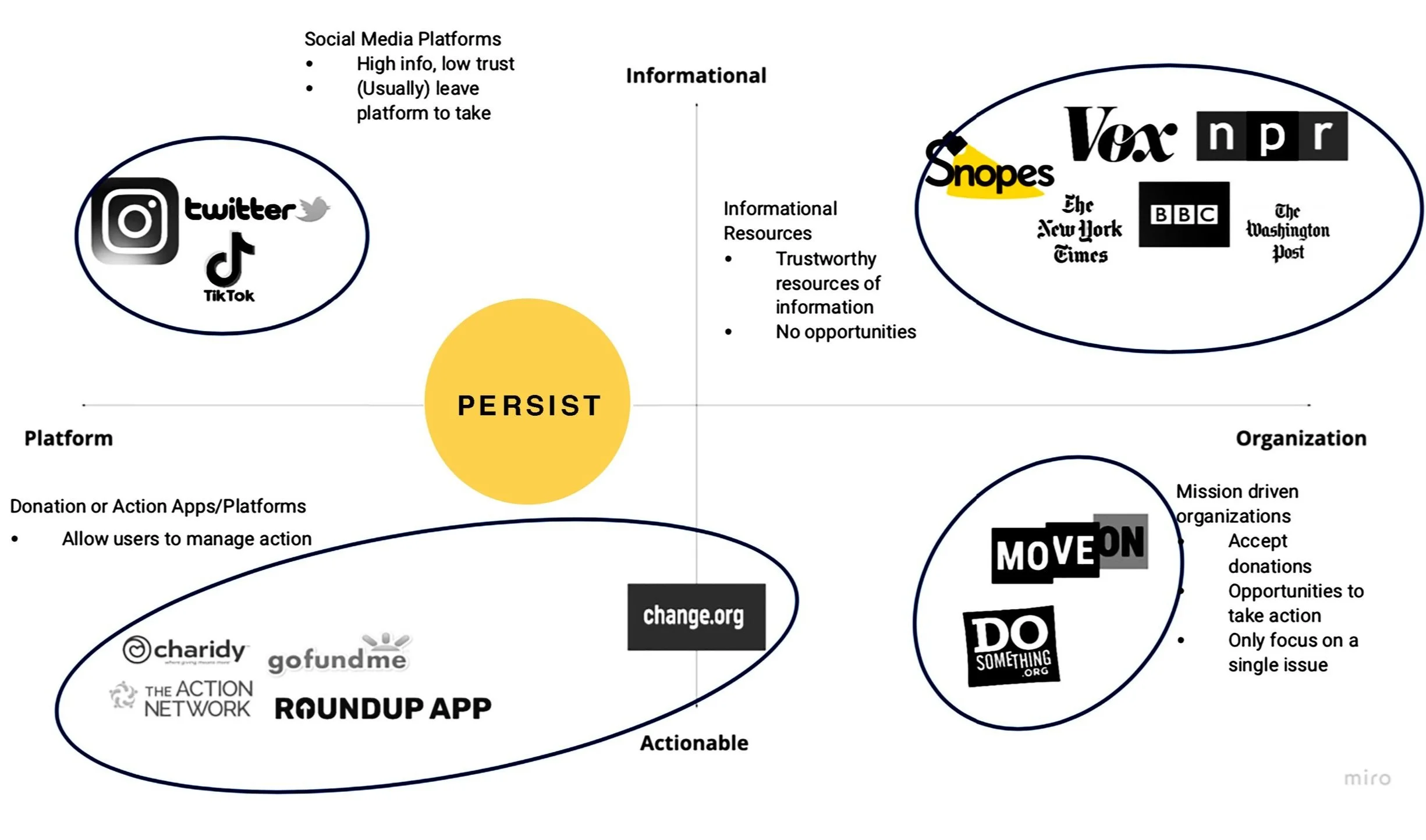
This Competitive Matrix allowed us to visualize the functions served by various platforms, organizations, and resources within the realm of social activism. We could clearly see that many competitors are clustered in the periphery of the given axes, leaving us with opportunities to create a platform-based solution that employs trustworthy information and incentives to participate.
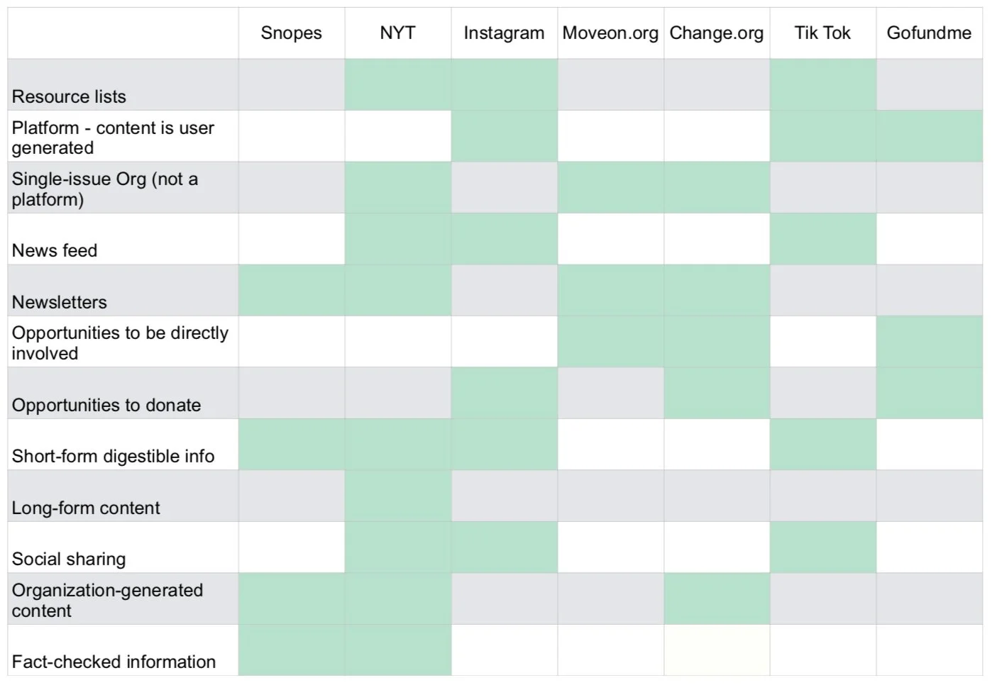
Crafting a Feature Analysis further allowed us to break down the offerings of other companies in the landscape, identifying additional gaps for our product to fill. We learned that social media platforms do not guarantee accuracy of shared information, and while they may feature donation buttons, they don’t offer meaningful routes to participation in social activism within their products. Single-issue organizations provide both information and opportunities to take part, but not across several organizations
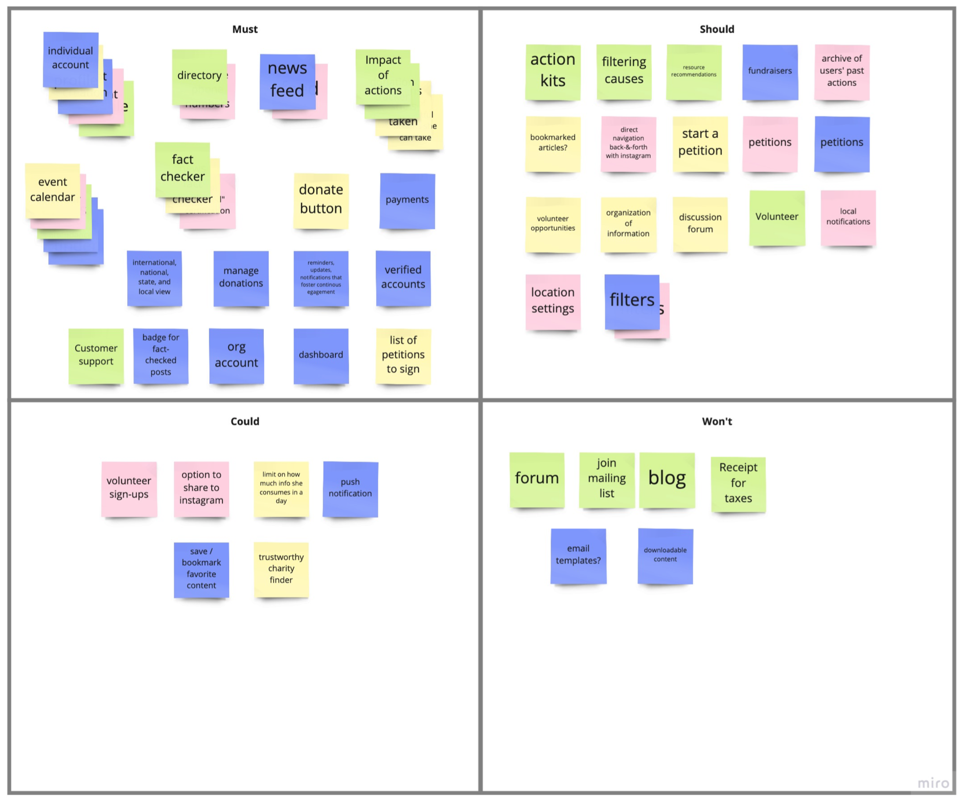
The MoSCoW Map is a grid prioritization method that helps us to identify our most critical features. These important aspects must be present in the first launch of our minimum viable product (MVP). Through categorizing features based on dispensability, we were able to focus our time, energy, and money on what is most necessary.
KEY TAKEAWAYS
Features that allow users to take action are critical to the value of the product
Fact-checked information is a key feature
Account information is necessary for users to log in, store info, and access history
Product must include a calendar, in order for users to visualize upcoming events
Our Feature Prioritization Matrix is a matrix that maps out the most important features, depending on necessity, effort, and expense. It helps us to prioritize features based on overall product strategy and objective.
KEY TAKEAWAYS
It is paramount that users can easily find events and other actionable opportunities
Users must have their own accounts in order to save events and resources for future reference
All information available must be fact-checked in order to fulfill our key value proposition
Design
Design Studio
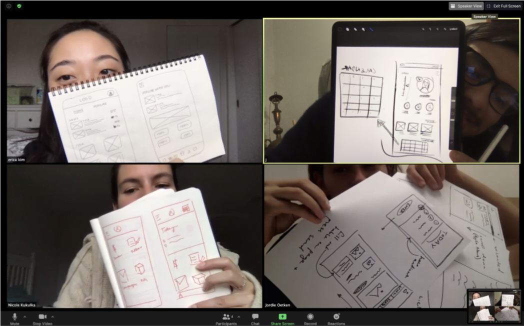
To begin our design process, our team conducted a design studio in order to determine the overall layout and structure of our application. We conducted multiple rounds, each visualizing various features of our application, before coming together to create the final version of our prototype on paper.
User Research Insights Recap
Mid-Fi Prototype
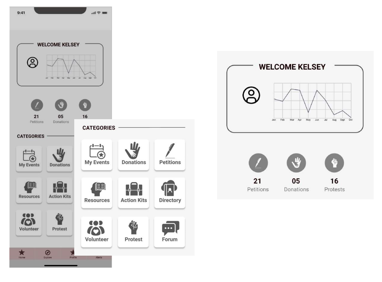
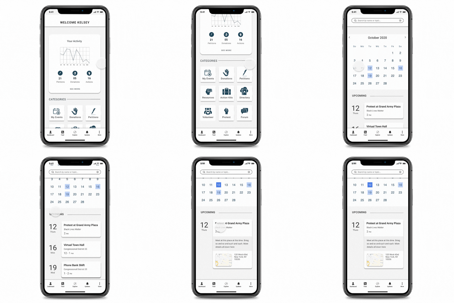
“Dashboard” page
Helps users keep track of their participation and access various resources.
Categories section allows information to be saved into organized, accessible sub-folders.
Graph allows users to visualize their activity over time.
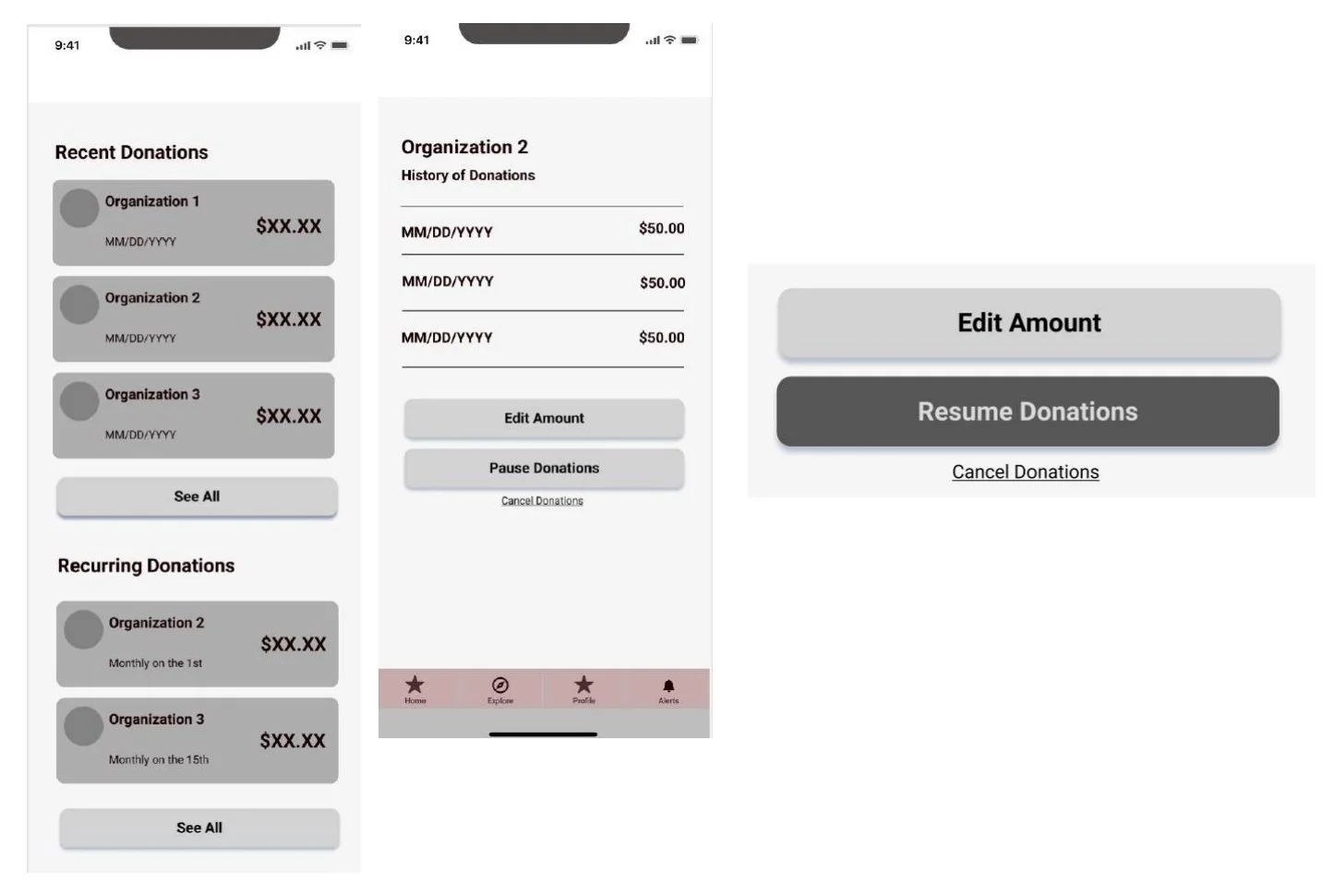
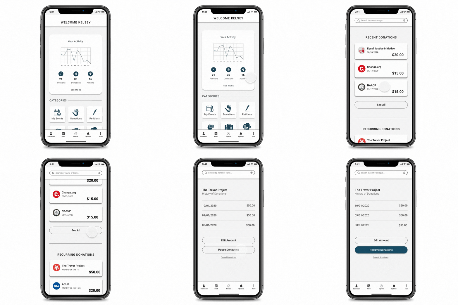
“Donations” Feature
Allows users keep track of contributions and donate safely through a secure platform.
Users are given the option to pause and resume their recurring donations.
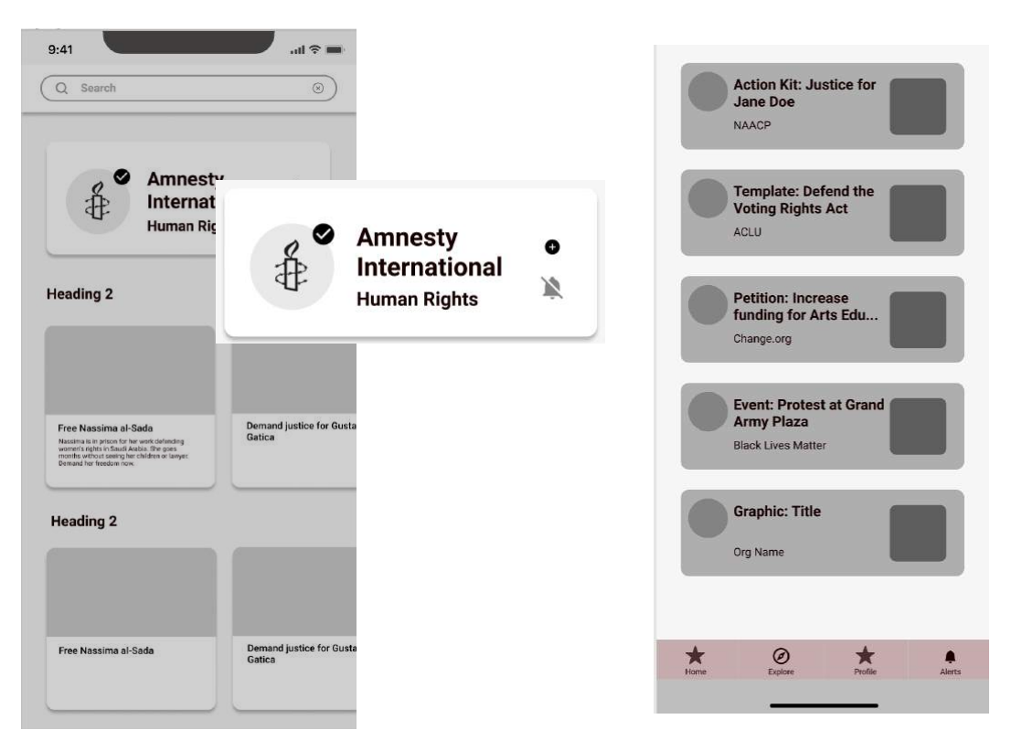
“Verification” Feature
Organizes access to articles, news updates, and relevant actionable information.
All information provided is from pre-verified, vetted sources, and may be viewed through the“Explore” and “Home” pages.
“Updates” Feature
Allows users to limit and manage the amount of information presented to them.
“Follow” and “Notify” buttons give users option to prioritize specific organizations.
Users are able to keep track of these notifications in the “Alerts” page.
Testing Our Designs
We conducted usability tests on our mid-fidelity prototype in person and over Zoom. Users were given contextualization of the prototype, and were then asked to complete three separate tasks. The user tested the clickable design while screen-sharing, and a stopwatch was used to time how quickly the user completed the tasks.
Through this initial testing phase, we learned that users navigated through the app as if the dashboard page were the landing page. They were unsure what the dashboard’s graph signified, and had trouble differentiating between the home and explore pages.
Insights
Users were unsure what the graph at the top of their Dashboard page signified
Some users scrolled through upcoming events before realizing they’d already passed their target
Users voiced confusion between the "Home" page and the "Dashboard" page, and were unsure why the home icon took them to a news feed
Solutions
Add more distinct labeling and descriptions, so users immediately know where they're looking
Introduce hierarchy in order to call attention to event subheadings
Change the Dashboard page to app's landing/home page
Replace "Home" page label with "Feed"
Move dashboard icon to far left in lower navigation bar
Introducing
MVP Features
A feed page, with updates from various organizations regarding gatherings, news, and other events users can attend.
A dashboard page, illustrating to users how many petitions they’ve signed, how many donations they’ve contributed, as well as how many events they’ve attended.
Verified information throughout the platform, and assurance that the information being read has been been pre-vetted and verified.
Planning for Action
We built a calendar that allows users to review their plans, as well as access additional information related to each specific event they’ve saved.
Managing Engagement
Persist gives users total control over their level of participation, and the ability to pause and resume contributions is just a single example.
Hi-Fi Usability Testing
With the first iteration of our high-fidelity prototype finalized, we conducted a second round of usability tests, once again observing users over Zoom with screen-sharing enabled.
Despite working to differentiate our explore page from our feed page, users still found the two easy to confuse. While the dashboard proved a more successful landing page, users expressed difficulty when attempting to navigate back to the dashboard from exterior pages.
Next Steps
Moving forward, our team recommendations further differentiating the structure of the “Explore” and “Feed” pages. Through greater delineation, users will understand that the “Explore” page is for finding new articles, petitions, and organizations, while the “Feed” page provides updates on organizations and topics the user already follows. Our team also recommends increasing the size of both the “follow” and “alert” buttons, as users had difficulty clicking at the present scale. Finally, it is advised to conduct another round of usability tests, and assess the effects of these improvements.


